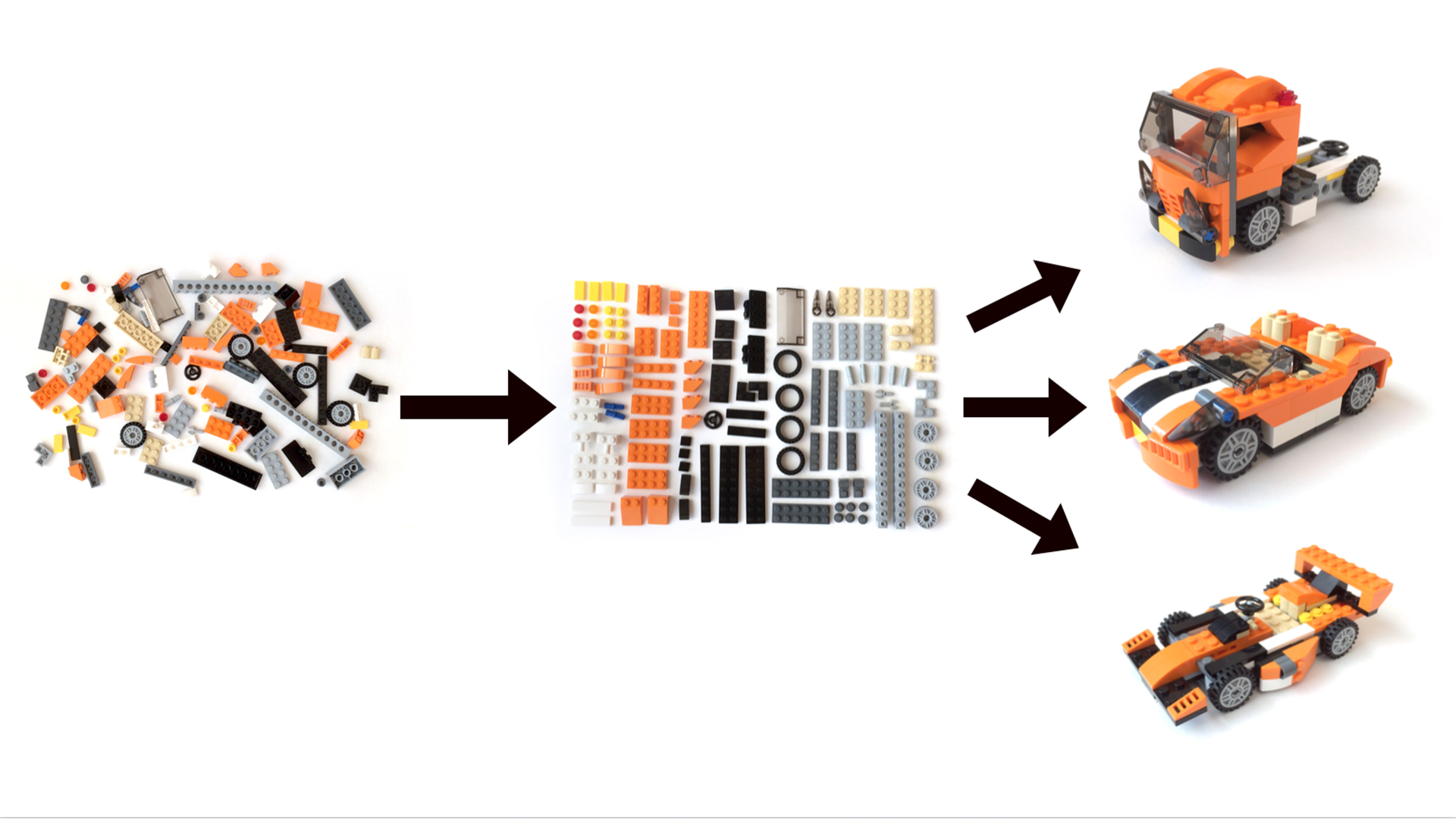
The company I work for is a multi-disciplinary agency which produces a wide range of work from websites, mobile apps, custom digital activations and touch-screen kiosks. Our touch-screen kiosks are quite versatile and very popular but designing each project felt like starting from scratch everytime. I wanted to find a way to streamline this process so that our designers and developers can work more efficiently.
One of the reasons our touch-screen kiosks are so popular is there is no limit to what content we can develop for them – it is ultimately a giant smart phone. This however poses as one of our biggest challenges. Each new kiosk project is different from the one previous and often it is like starting from scratch every time. Also there was no consistency in each of the designs and developers complained about having to code up new components, with different attributes, fonts and colours etc.
Screenshots

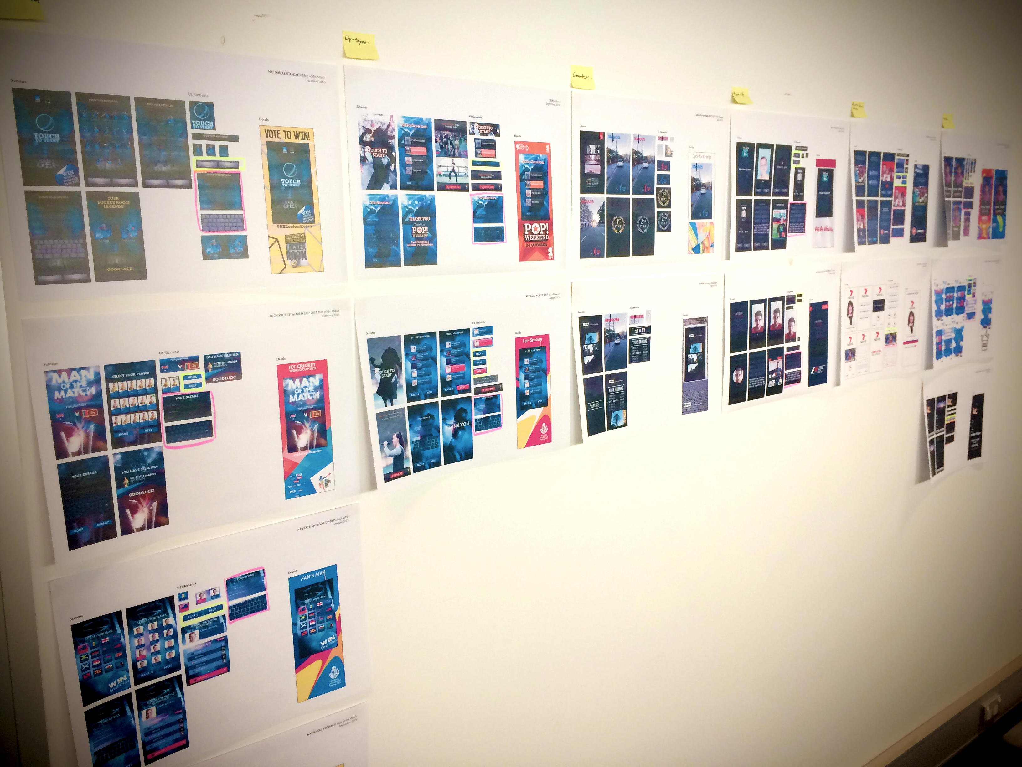
First thing I needed to do was see what I was working with. I opened up photoshop and started screenshoting all the kiosk UI. I also took screenshots of each of the UI elements, buttons, forms, keyboards etc. Next I printed them all out and stuck them on the wall. Once I did this I realised I could categorise each of the kiosks into groups titled; Man of the Match, Lip-Sync, Commuter, Face-off, Video/Photo Message and Other.
After seeing all our kiosk displayed on the wall our team noticed some things already standing out as similar across most of the kiosk, such as the main page navigation and form fields and keyboards. We started making a list of components and discussed what worked and what didn’t. This also generated excitement all round, with our designers wanting to include more dynamic styles and interactions.
Before we got into full layout comps, we adopted a process from Atomic Design, element collages, which are collections of UI component design explorations. This allowed us to focus on individual components, their design and purpose, without having to spend time placing them in to a final layout. We then can see what visually works when the components were placed beside each other and started to see some consistency in the style.
Once the content audit was done we had clear objectives of what components we were going to focus on. Onto the next fun part. Design.

Leave a Reply