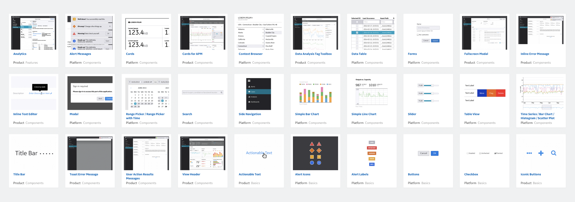
Before I begin creating a Pattern Library I had several questions that I asked myself:
What is a Pattern Library? What is it used for? How is it used? What are some good examples of Pattern Libraries? And finally do I need a Pattern Library?
So with these questions and many more swimming around in my head, I’m off taking the first steps into Pattern Libraries, Research.
Researching is so important to any projects I begin. It always begins with a set of questions and then with all knowing google at my finger-tips I read, cut and collate everything I find using Evernote. There are many advantages to using a digital note taker one of which is being able to paste in hyperlinks and accessing your notes on any device.
What is a Pattern Library
A Pattern Library can best be described as a living style guide, specifically designed for UI/UX. It’s a set of instructions on how best to approach complex interactions by listing the building blocks that go into an application. It’s set of rules which go into each component. It allows coders and designers to communicate clearly with a shared vocabulary. Because Pattern Libraries is a dynamic style guide, it is meant to be used practically and therefore constantly refined and updated. It encourages iterations and ensures consistency, allowing both designers and coders to work efficiently and quickly producing a clear goal and getting results faster.
Atomic Design
During my research I came across a developer named Brad Frost. He wrote a book about his approach to responsive web design called, Atomic Design. In his book, which you can read online, he explains that a web page is made up of small components, atoms and molecules and it’s the way each of those components are assembled and put together that is important. In his book he makes us look at the ingredients not the final design and this is a shift from the way people have been designing web sites. Whereas before, people would design websites from the static template we now see a trend of designing websites to a more dynamic system of adaptable components. Alot of what I’ve read about Pattern Design seems to be inspired mainly by Atomic Design. It’s about designing systems rather than pages.
Pattern Library Checklist
With Atomic Design in mind, I wanted to make a list of ingredients that I wanted to focus on for my Pattern Library:
- Design Strategy: This is more of a sense of purpose. A guide or platform.
- Global Elements: These include containers, normalisers, padding, margin. Real basic rules
- Links: Covering the different states; active, focus, hover. Not just going with default.
- Navigation: How to treat accordians, breadcrumbs, menu bars, hamburgers or no hamburgers.
- Typography: Headings, Subheads, Pull Quotes,
- Buttons: Primary and secondary. Hover, active, focused, clicked and disabled states.
- Colours: Primary and secondary. Tints and gradients.
- Icons: Responsive iconography, social media icons, buttons, badges and avatars.
- Images: Hero images, thumbnails, format, size thresholds and responsive behaviour.
- Data Visualisations: Bar charts, pie charts, graphs and timelines. Static, animated or both.
- Forms: Headings, form elements, inputs, textarea fields, radio buttons.
- Alerts/ Pop overs
- Grids
- Tables
- Layouts/Templates
- Motions, Transitions and Animations
- Error page 404
I’m sure that as I progress I’ll be adding and removing items from this list, but since I’m writing about Pattern Libraries it’s only natural there will be changes along the way.

Leave a Reply